The Ruler Tool


The Ruler Tool |
|
|
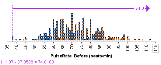
The Ruler Tool Introduction to the Ruler Tool Using the ruler tool, you can measure the distance between points on a continuous axis. It's useful for quickly computing, for example, the range of a distribution or the difference between the averages of two groups. You can also use it to create a measure of variability around an average by measuring the distance between the average and one case, and then having TinkerPlots compute the difference between the average and all the cases in a distribution. To add a ruler to a plot and position it,
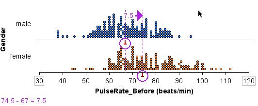
In the Ruler Options menu (found by clicking to the right of the Ruler button) are commands for flipping the ruler (moving the arrow to the opposite end), and changing between vertical and horizontal orientations. Snap and Lock Ruler Ends You can snap the ruler ends onto specific spots. In the graph below, we've used the ruler to measure the difference between the medians of male and female pulse rates. To make sure that the ruler ends are exactly on the medians, the ends have been snapped to the medians, as indicated by the purple circles around the median icons.
To snap and lock a ruler end,
Change the object the ruler is locked to by clicking on either the dashed line or the edge of the lock circle and dragging the circle off the current location. Create a Measure of Variability by Measuring All You can use the ruler tool to construct various measures of variability, such as the mean absolute deviation (MAD), and even to invent new ones. Creating such measures step by step, and testing and critiquing them, can help build an understanding of how such measures work and how to interpret them. To construct a measure of variability around an average:
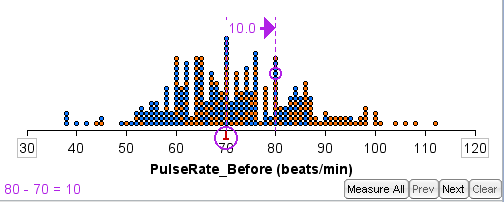
At this point, your plot will look something like the one shown below. The ruler shows the distance from the median (or mean) to the case that you snapped on. This difference is displayed both at the arrow end of the ruler and in the status field at the lower left of the plot window. When you have snapped onto both an average and a case, a Measure All button appears in the lower right corner of the graph.
To measure the differences between all the cases and the average:
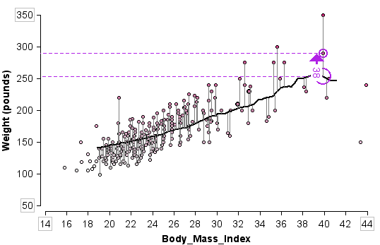
The ruler will animate and show all of the distances being computed (you can instead step though them manually using the Next button.) As the animation progresses, the display at the lower left accumulates the sum of these differences. Hint: This animation is often more effective if you have stacking turned off. This allows you to see more clearly the individual difference lines as the animation progresses. It can also be informative to order the cases vertically by x-axis attribute. Compute Average of Differences This sum of the differences is not, by itself, a very useful measure of variability. When measuring around the mean, for example, the sum of these differences, by definition, is always 0. But the sum is a good place for students to start, and investigations can uncover its weaknesses. They will usually suggest as a remedy looking instead at the absolute values of those differences. The Ruler Options menu has this as an option (choose Absolute Difference). Future discussion can lead to the insight that the mean (or median) of these differences will work better than the sum, because the latter will depend on the number of values. Again, options for computing Mean of Differences and Median of Differences are in the Ruler Options menu. Measures for Separate Groups Either before or after clicking Measure All, separate the distribution into two or more groups. The computations will create separate measures for the averages of each group. You can compare these measures in the status field in the lower left of the plot. Measures of Variability for Fits Through Scatterplots If you have created a fit through a scatterplot (see, for example, Line Trace), you can use Measure All as described above to compute a measure of variability around the line or curve of fit. (For examples of summarizing scatterplots with lines or curves, see the TinkerPlots movie "Exploring Relationships 2.") These fits can include hand-drawn lines, the diagonal line, and a line trace from the color meter. Here is a scatterplot of Body_Mass_Index and Weight. The line of fit is a running mean that was created using the trace option of the Color Meter. After doing a Measure All around it, you can see lines displayed that show the distance from each case to the line.
To measure the difference between a line/curve of fit and the cases in a scatterplot,
Create Attribute of Residuals To create an attribute of the differences (residuals) between each value and the average (or fitted line/curve),
Note: This attribute is not formula based, so if you change anything in the plot, the difference values will not dynamically update.
|