Color Meter


Color Meter |
|
|
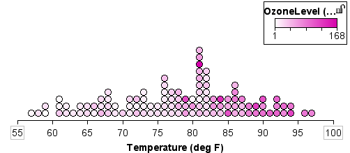
Color Meter Use the color meter to help determine whether two continuous attributes are associated. We recommend that you watch the movie "Exploring Relationships 2" for a demonstration of the color meter. The plot below shows Temperature on the x-axis. The attribute OzoneLevel has been selected to color the graph. From this display it seems clear that as temperatures increase, the values of ozone also increase, because they become darker pink as you move across the plot from lower to higher temperatures.
The color meter helps to sharpen your perception of this relationship. To add a color meter to a graph,
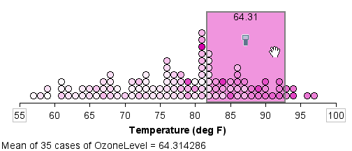
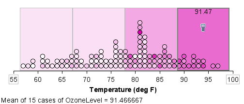
You can move the color meter window across the graph by clicking and dragging the rectangle. You can change the size of the color meter window by clicking and dragging the right or left edge. The color meter window displays the average (mean or median) values of the cases included within it for the selected attribute—the attribute whose color is applied to the cases. It displays this average as a value at the top of the color meter window and in the status display below the graph. It also applies this value to the color of the window; so as you slide this window from left to right on this particular graph, you'd see the window tend to get darker as you move further to the right. Color Meter Snapshots To overlay the graph with colored snapshots,
The results will look something like the plot below.
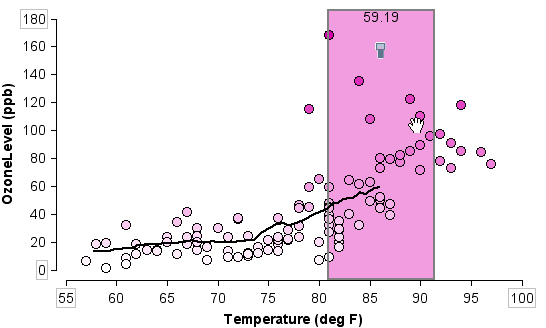
To use the color meter to fit a smooth, running average through a scatterplot,
As you move the window along, the running average of all the cases in the window will be graphed as a curve through the scatterplot, as shown below. This curve is the average (you can choose mean, median, or midrange from the Color Meter Options menu) of the values currently within the window area. Often, there are few cases at the ends of distribution, and so the curve will be less reliable.
If you want to include this graph in a report, you will probably want to remove the color meter window. Choose Hide Color Meter from the Color Meter Options menu.
|