|

Dot Map
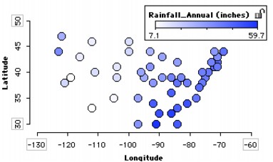
Some collections include attributes that measure the location of cases in some physical space. With this type of data, you can make a map-like graph. The example shows the locations of the capitals of 48 of the 50 U.S. states using their longitudes and latitudes. The case icons are colored to show annual rainfall in each state.
To make a dot map,
1.
|
Put the attribute measuring the horizontal position on the horizontal axis. From the data cards, drag the attribute name onto the horizontal axis of the plot (the lower part of the plot will highlight to indicate when you can drop).
|
2.
|
Fully separate the attribute. In the plot, drag a case icon all the way to the right (until there are no bin lines). This will fully separate that attribute horizontally.
|
3.
|
Put the attribute measuring the vertical position on the vertical axis. From the data cards, drag the attribute name onto the vertical axis of the plot.
|
4.
|
Fully separate the attribute. In the plot, drag a case icon all the way up to fully separate that attribute vertically.
|
5.
|
Color the plot by an attribute. In the data cards, click an attribute name to highlight it. This will apply that attribute's color scheme to the case icons.
|
In the example, a color key was added (click the Key button in the upper plot toolbar).You could also paste an image of the US map into the background of the plot.
TinkerPlots Help
© 2012 Clifford Konold and Craig D. Miller
|
|


