Box Plot


Box Plot |
|
|
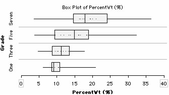
Box Plot The "box" part of a box plot shows the locations of the 25th, 50th, and 75th percentiles. The box plot's "whiskers" extend out to the end of the range. Box plots are particularly useful for comparing attribute values for several different groups. The example shows how much students' backpacks weigh as a percentage of their body weight. These results are shown separately for students in grades one, three, five, and seven. The box plots show that the older students tend to carry backpacks that are a higher percentage of their body weight. They also show that there is more variability (spread) in how much students carry at the higher grades than at the lower grades.
To make a box plot,
In the example, the icons were stacked horizontally (click the Stack Horizontal button in the upper plot toolbar), case icons were made very small (adjust the slider in the lower plot toolbar), and another attribute (Grade) was added to the vertical axis (drag the attribute name from the data cards to the left side of the plot). As an option, you can set the box plots to show outliers (choose Show Outliers from the Hat Options menu).
|