Hat Plot


Hat Plot |
|
|
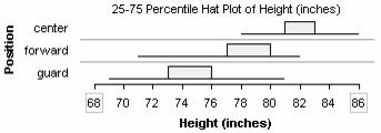
Hat Plot Hat plots divide a numeric attribute into three sections, a central "crown" and, on each side of the crown, two "brims." The brims extend out to the minimum and maximum values. In the Hat Options menu, you can select among four options for how the crown of a hat plot is formed: based on percentiles (the default), the range, the average deviation, and the standard deviation. The example uses the percentile option.
To make a hat plot,
In the example, the case icons were hid (choose Hide Icons from the Icon Type menu in the lower plot toolbar) and an attribute (Position) was added to the vertical axis (drag the attribute name from the data cards to the left side of the plot). You can drag the edge of any hat crown left or right to set percentile-division points to different values.
|