|

Time Series Graph
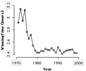
Also known as a line graph, a time series graph shows how the value of an attribute changes over time. The example shows the running time (in hours) for the female winner of the NYC Marathon over roughly the last 30 years.
To make a time series graph,
1.
|
Put the time attribute on the horizontal axis. From the data cards, drag the name of the time attribute onto the horizontal axis of the plot(the lower part of the plot will highlight to indicate when you can drop).
|
2
|
Fully separate the attribute. In the plot, drag a case icon all the way to the right (until there are no bin lines). This will fully separate that attribute horizontally.
|
3.
|
Put a numeric attribute on the vertical axis. From the data cards, drag the name of a numeric attribute onto the vertical axis of the plot.
|
4.
|
Fully separate the attribute. In the plot, drag any case icon all the way up to fully separate it vertically.
|
In the example, a line connecting the cases was added (select the Line button in the upper plot toolbar).
TinkerPlots Help
© 2012 Clifford Konold and Craig D. Miller
|
|


