|

Binned Scatter Plot
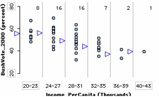
This graph shows a numeric attribute binned along the horizontal axis and another numeric attribute, fully separated, on the vertical axis. The example shows the per capita income (in thousands of dollars) of the 50 U.S. states and the percentage of each state who voted for George W. Bush in the 2000 presidential election. This graph seems easier for people to interpret than a scatter plot. And by adding the means of the bins (blue triangles), it provides a powerful way to see general trends in the data.
To make a binned scatter plot,
1.
|
Put a numeric attribute on the horizontal axis. From the data cards, drag the name of a numeric attribute onto the horizontal axis of the plot (the lower part of the plot will highlight to indicate when you can drop).
|
2.
|
Separate the attribute. In the plot, drag a case icon to the right to make two to eight bins.
|
3.
|
Put a numeric attribute on the vertical axis. From the data cards, drag the name of a numeric attribute onto the vertical axis of the plot.
|
4.
|
Fully separate the attribute. In the plot, drag a case icon all the way up. This will fully separate that attribute vertically.
|
In the example, the icons were stacked vertically (click the Stack Vertical button in the upper plot toolbar), the mean was added (click the blue triangle Average button in the upper plot toolbar), and a count was added to show the number of cases in each bin (click the Counts (n) button in the upper plot toolbar). If you selected the Line button on the upper toolbar, a line would connect all of the average.
TinkerPlots Help
© 2012 Clifford Konold and Craig D. Miller
|
|


