|

Pie Graph
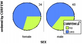
Pie graphs display cases as pie wedges. Pie graphs are useful for comparing the relative numbers of values of various types. The example compares the proportion of male and female high school students who have curfews set by their parents. Be aware that the size of the circle gives no indication of the number of cases that are in it. A circle containing 100 cases will be the same size as a circle containing one case. This is why it's a good idea to display the number of cases in each pie. (See Rectangle Graph for a similar type of display that does indicate different sample size.)
To make a pie graph,
1.
|
Set the icon type to Fuse Circular. In the lower plot toolbar, choose Fuse Circular from the Icon Type menu.
|
2.
|
Put an attribute on the horizontal axis. From the data cards, drag the name of an attribute onto the horizontal axis of the plot (the lower part of the plot will highlight to indicate when you can drop).
|
3.
|
Color by another attribute. In the data cards, click the attribute you want to use to color the pies.
|
4.
|
Order the cases. In the upper plot toolbar, click an Order button to group cases of the same value in the pies.
|
In the example, a color key was added (click the Key button in the upper plot toolbar) and the number of cases for each gender was displayed (click the Counts (n) button in the upper plot toolbar).
TinkerPlots Help
© 2012 Clifford Konold and Craig D. Miller
|
|


