Frequency Bar Graph

Previous  Terms  Next

TinkerPlots_logoV2-rgb


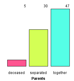
Frequency Bar Graph

This graph shows the counts for values of an attribute.

Freq bar graph

To make a frequency bar graph,

1.

Put an attribute on the horizontal axis. From the data cards, drag the name of an attribute onto the horizontal axis of the plot (the lower part of the plot will highlight to indicate when you can drop).

2.

Stack vertically. In the upper plot toolbar, click the Stack Vertical button.

3.

Click the Counts N button in the upper plot toolbar.

You can change the size or type of the icons using options on the lower plot toolbar. Here the icon type is set to Fuse Rectangular to make solid bars. With numeric attributes, you can also increase the number of bins by dragging an icon to the right.


TinkerPlots Help

© 2012 Clifford Konold and Craig D. Miller