Value Bar Graph


Value Bar Graph |
|
|
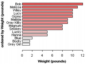
Value Bar Graph Also known as a case-value graph, this graph displays the value of each case as a bar of a particular length. The length of the bar depends on the value of the case. In the example here, the bar lengths correspond to the weight (in pounds) of each of 17 cats.
To make a value bar graph,
In the example, the bars are also ordered vertically by Weight (with Weight selected in the data cards, click the Order Vertical button) and the bars are labeled with the cats' names (with Name selected in the data cards, click the Label button on the upper plot toolbar and then set them to display on the left).
|