Basic Operations


Basic Operations |
|
|
Basic Operations You can apply the different operations and features of TinkerPlots in any order to make a particular graph. Here we describe the three basic operations that you use to arrange case icons. These are Stack, Order, and Separate. Using these in different combinations, you can make lots of different graphs. The buttons for these three actions are located on the upper plot toolbar. When a button is on, it appears white and you can see its outline. In the example here, Order (vertical) is currently on. Clicking that button again would turn Order off.
Stacking arranges case icons in horizontal or vertical rows. To stack case icons vertically or horizontally,
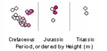
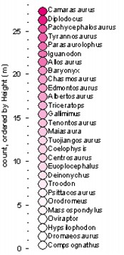
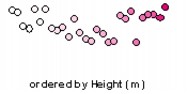
Here's some additional information about stacking. •You can't stack both ways at the same time. So, if the icons are stacked horizontally and you click Stack Vertical, the Stack Horizontal button will turn off at the same time the Stack Vertical button turns on. •If it can, TinkerPlots will stack the icons in a single column (or row). However, there often isn't enough room in the plot to do this. So TinkerPlots "wraps" the stack around, making multiple columns or rows. If it needs even more room, TinkerPlots will squish the icons together. If you want to reduce the wrapping or squishing, make the plot window larger and/or the case icons smaller. •In some situations, stacking will do nothing to the plot (for example, when you have a scatter plot or a plot using Fuse Circular icons). •By default, icons are stacked in random order. You can stack them in case order by choosing Stack by Case Order from the plot's Options menu. Tip: Make a stack and then order it by a numeric attribute. This makes a very simple graph that shows how cases "stack up" on a particular attribute. Below is a graph of dinosaurs, stacked and ordered by their height. If your question is "Who are the tallest and shortest?" this graph may be just what you need.
Ordering arranges cases by their attribute values. To order case icons vertically or horizontally,
When you have order turned on, the name of the attribute you've ordered by appears in the plot window. For horizontal order, the name appears along the bottom of the window. For vertical order it appears along the left side. If there is also an attribute on an axis, the name of the ordered attribute appears after it, following a comma.
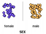
Here's some additional information about ordering. •You can have both order buttons turned on at the same time, ordering in one direction by Height, for example, and in the other direction by Weight. •For numeric attributes, cases are arranged in ascending order, from smallest (bottom or left) to largest (top or right). You can arrange in descending order by holding down Alt (Win) Option (Mac) as you order. •For category attributes, cases are ordered alphabetically by the attribute's values. For example, you might use the words "One," "Two," "Three," and "Four" to code the Grade students are in. If you ordered the cases by Grade, TinkerPlots would order them "Four," "One," "Three," "Two." •In some situations, ordering will do nothing to the plot (for example, it will not affect a scatter plot). The reason is that the case icons are "locked in place" in a scatter plot and there is no direction for them to move to show their order for another attribute. This operation separates the cases in a plot according to their attribute values. For example, with a collection on students at your school, you might want to separate "male" from "female," or place students into separate groups according to their ages. When you separate cases into groups, TinkerPlots adds bin lines between the groups, puts the name of the attribute you are separating by on the axis, and displays labels along the axis (such as "male" and "female") to show what's in each group.
There are three ways to separate icons into groups:
To return a plot to its original, disorganized state,
The Mix-up button removes all features that have been added to a plot, including any attributes on the axes. The case icons will scatter randomly. If the icons are already mixed up, they will move to new random locations.
|

 or
or