Common Uses of Sliders


Common Uses of Sliders |
|
|
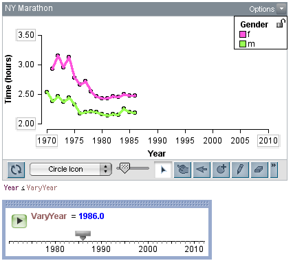
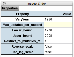
Common Uses of Sliders Here we describe a few possible uses of sliders in TinkerPlots. The folder Data and Demos | Demos includes several TinkerPlots files that use sliders in various ways. As you'll see in those documents, sliders are easy to use once they have been created. But useful sliders are not so easy to set up in the first place. Thus sliders are not things that students themselves should in general be figuring out how to construct. Rather, they are resources for teachers and curriculum designers to use in creating data sets and activities for students. Many data are collected over time. For example, the data set NY Marathon.tp includes the running times for the male and female winners of the New York City Marathon from 1970 through 2004. Plotting data such as these over time often reveals interesting patterns and trends. You can use plot filters and sliders to "re-enact" such events that occur over time. This allows you to add data to the plot over time. Results are much like time-lapse photography. These time animations can help students learn how to read time series plots (by scanning visually from left to right along the time axis). The animations can also help you detect subtle patterns in the data that are hard to see when you view them all at once. To create a slider that allows you to add data to a plot in the order they were collected,
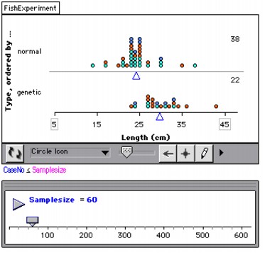
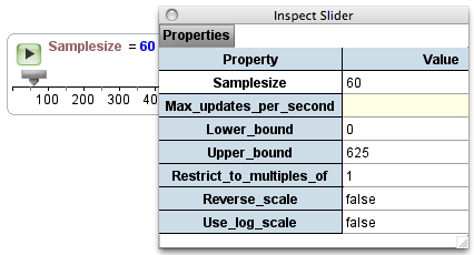
In this example, when you add the data to the plot over time, you clearly see that the winning times for males and females tend to go up and down together from year to year, perhaps reflecting the effect of weather conditions on run-times. This relationship is not as easy to detect when all the data are on the graph at once. When looking at a sample to explore a particular question, students will often ask, "But what would happen if we collected more data?" One way to let young students explore this question is to "grow" samples-to randomly draw cases from a larger population and observe how the sample changes, and doesn't change, as it gets larger. Though you can do this with real data, the example here uses made-up data. Open the demonstration document Fish Experiment Demo.tp to see the data. The cover story involves a fish farmer who has stocked a pond with both normal fish and a new type of genetically altered fish that is supposed to grow longer than the normal fish. To test this claim, the farmer catches the matured fish from the pond and measures them. The demonstration allows you to capture data from the collection and display it in a plot. Use the slider beneath the plot to gradually increase the sample size until, if you want, you can view all 625 fish in the pond. When students in grades 4-6 have used these data both on and off the computer, they have come to observe that even when their sample is still relatively small, certain features of the larger population are usually already evident, such as where the data tend to be centered. The following steps describe how this document was set up using sliders, filters, and attribute formulas.
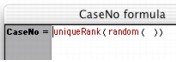
In this example, the attribute CaseNo was created using a formula that allows you to quickly reassign case numbers to the 625 values. Thus you can redo this experiment over and over, seeing what happens if the fish happened to be sampled in a different order. To randomly assign new values of CaseNo to the cases,
If you have data in the graph, you'll see it change location as a new sample of fish are "caught." Here's the formula for CaseNo we use to do that.
The formula combines two functions. The inner-most function, random(), randomly assigns each case a real number from 0 to 1 (the default range for this function). So each case in the data set gets some value such as 0.56779. The function uniqueRank then takes these random numbers and assigns them a unique ranking from 1 to 625 (the number of cases we have) based on their value. If two or more of the cases happened to have random numbers of the same value, which would be extremely unlikely, the function uniqueRank will arbitrarily give them unique rankings anyway. This is all just a complicated way of randomly reordering the 625 cases and giving them a number based on this ordering. You can use a slider along with formula-derived attributes to create and quickly modify hypothetical data. See Create Realistic Data in the section Common Uses of Formula-Defined Attributes.
|