|

Frequency Table
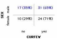
Frequency tables display the counts (and/or percents) of cases of various types. You can make frequency tables for a single attribute, or for two attributes as in our example. The example shows the numbers (and percents) of male and female high school students who have and don't have a curfew. The example show the values in two different colors to indicate how the percents were calculated. Here the percents were based on the row totals, so they show what percent of males (65%) and what percent of females (71%) have curfews.
To make a frequency table,
1.
|
Put an attribute on the horizontal axis. From the data cards, drag the name of an attribute onto the horizontal axis of the plot (the lower part of the plot window will highlight to indicate when you can drop).
|
2.
|
Add counts and/or percents. In the upper plot toolbar, click the Counts (n) button and/or the Counts (%) button.
|
3.
|
Hide the case icons. From the Icon Type menu in the lower plot toolbar, choose Hide Icons. (You could also adjust the Icon Size slider in the lower plot toolbar to make the icons very small.)
|
In the example, the category attribute Sex was added to the vertical axis (drag the attribute name onto the far left side of the plot).
TinkerPlots Help
© 2012 Clifford Konold and Craig D. Miller
|
|
